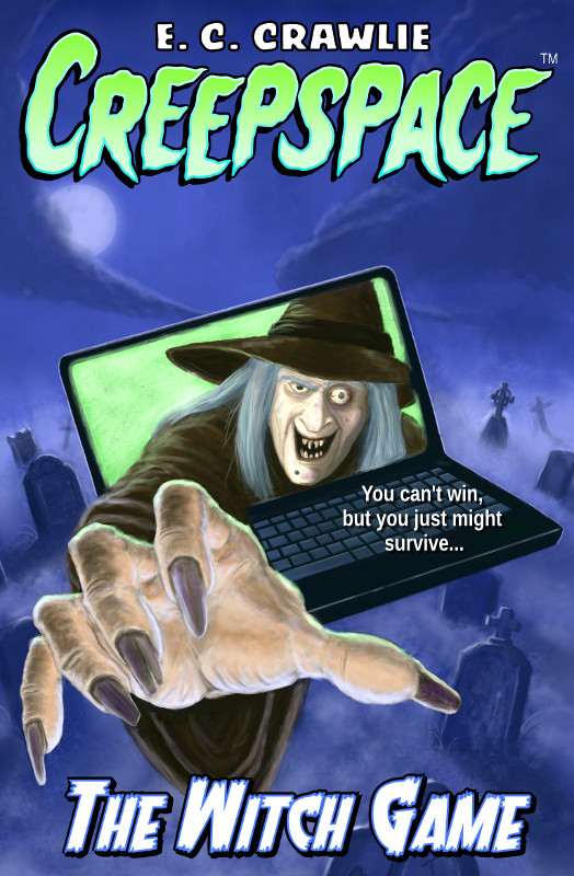
When I first published Creepspace: The Witch Game, I also did the cover art and, at the time, it was the best I could do. But that cover didn’t entice the right age group (ages 8 – 12). It did seem to appeal to kids in the 4 – 6 age range, but they’re too young for the book.
Tag: featured
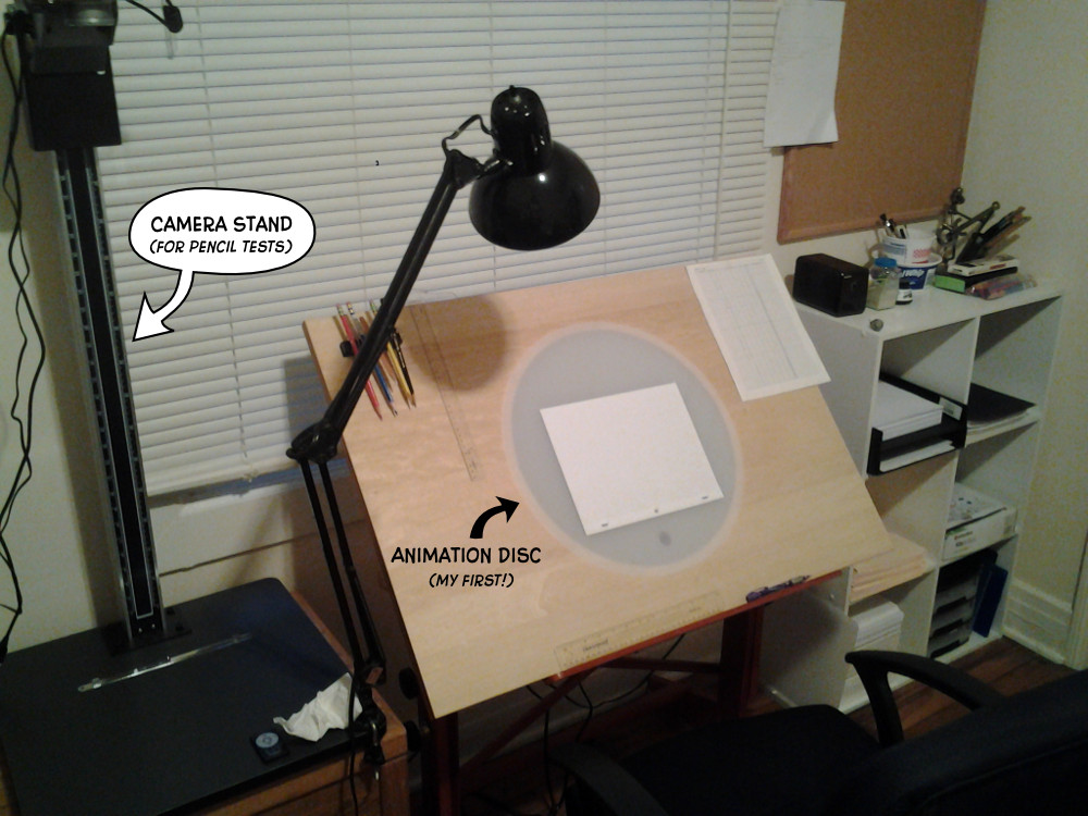
Today I finally got to set up my work space for my “Summer Camp” project. This summer, I’m treating myself to animation camp … in my spare bedroom. It took most of the afternoon to clean the space out, then to gather, assemble, hang, or otherwise make useful all of the various pieces of my master plan, but now it’s all there. (A special thanks to Adam for helping me put the animation table together last weekend.) Now all I have to do is the work. I took a picture because this is likely the last time that space will be neat for a while. (Sorry, De. 😉 )
This is a second pass at the little animation I posted here. I reworked the landing slightly and then played with Pencil’s coloring tools. The alpha protection mode is actually really useful for shading and highlights, but I’m still not crazy about the quality of the finished line on the character. I also did a really quick background in Gimp.