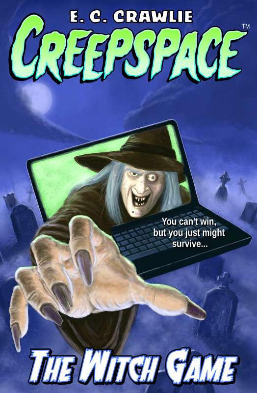
When I first published Creepspace: The Witch Game, I also did the cover art and, at the time, it was the best I could do. But that cover didn’t entice the right age group (ages 8 – 12). It did seem to appeal to kids in the 4 – 6 age range, but they’re too young for the book.
Tag: Gimp (Page 1 of 2)
This post is actually kind of momentous though it may not seem like much. First, the not so important part: I did some testing in Flash to see how I might be able to get decent line quality using Flash as a frame-by-frame animation tool. It’s okay, I guess, though the underlying drawing is kind of sucky. On the second head, I experimented with using blurs on some elements.
This is a second pass at the little animation I posted here. I reworked the landing slightly and then played with Pencil’s coloring tools. The alpha protection mode is actually really useful for shading and highlights, but I’m still not crazy about the quality of the finished line on the character. I also did a really quick background in Gimp.
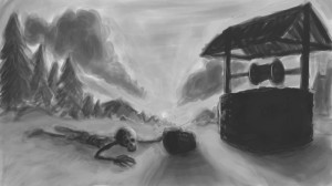
I’m trying to work on values a bit with this practice piece. It obviously has a long way to go before it has a chance of looking like anything. This will be in color once it’s done. Gimp 2.8.
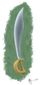
Heh. See what I did there? Ahem. But seriously, I really need to learn how to paint metal surfaces properly. Not there yet. But, hey, first post of the new year! 🙂
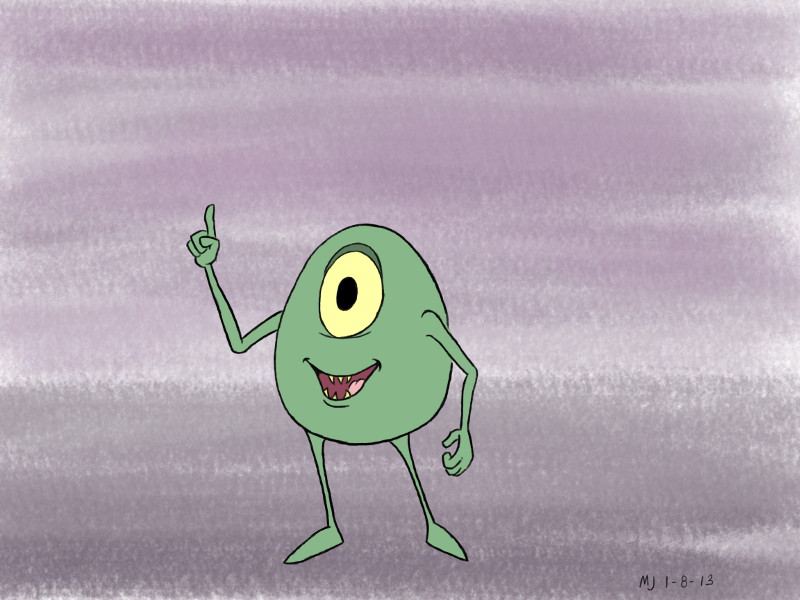
I gave MyPaint a spin tonight with only a little assist from Gimp.